Olson
A Digital Agency’s Budget-Friendly Space Borrows Brick and Beam Vibes
When they moved into a new space in a downtown tower, Olson, like most start-ups, was hoping to see rapid growth. The digital marketing agency had already doubled in size, thanks to a merger. They needed a space that would accommodate the expanding team as soon as possible. It would have to be ready to reconfigure at the drop of a hat, and it had to be done on a very modest budget.
The client loved the character of the brick-and-beam building it was leaving, but had been unable to find a similar space that could accommodate the larger team. They’d seen locations we’d designed for other agencies such as Saatchi & Saatchi and Edelman, and hoped to establish a similar loft-like vibe in the 20,000-square-foot space they’d leased.
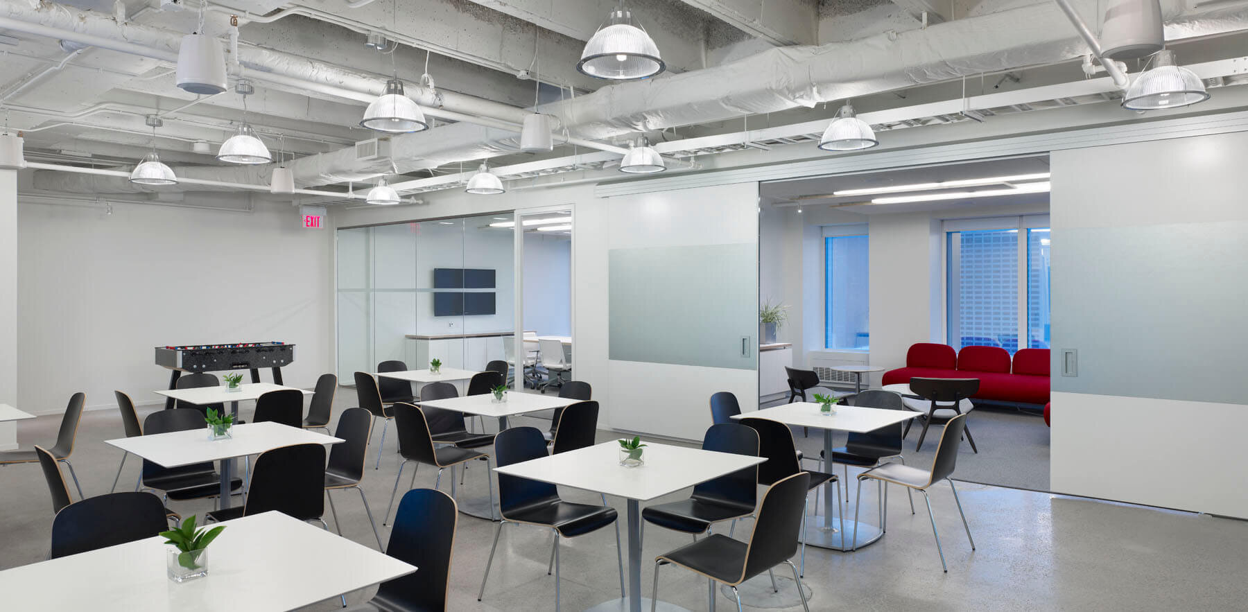
In stripping out the existing suspended ceilings – a key move in achieving that airy loft feeling – we revealed a coffered concrete plane that brings dimension and visual interest to the space. The ceiling and polished concrete floors sandwich crisp white perimeter walls. Blasts of the red used in the company’s logo add energy and contrast.
At the core of the space, a main pitch room, furnished with colourful soft seating, opens up to the office café to form a Town Hall where the entire staff can gather. Work areas are bright, and flexible, with plenty of room for growth. In fact, the roominess of the space inspired the company to bring in scooters to make travelling from one zone to another more fun. Communication and creativity are on display throughout thanks to a plethora of writable surfaces – the glassed-in private offices, whiteboard walls and even the windows are all devised to be written and sketched on whenever and wherever those creative juices start flowing.


