Saatchi & Saatchi
Establishing a Creative Branding Statement for an Advertising Icon
How do you design an office for a creative icon? For Saatchi & Saatchi – our first of more than 20 ad agency clients – we took as simple an approach as possible. We stripped the space to its basic elements – a concrete floor and exposed ceilings – to create a loft-like interior that belies its tower location. And then we got really creative.
As with other ad agencies, Saatchi & Saatchi’s teams need to collaborate. It takes brainstorming, writing, visuals and tons of feedback to build a successful advertising strategy. In the previous office, meeting rooms were regularly over-booked, but rarely used to capacity. So why not make it easier for all this collaborative work to happen right at the desks?
We developed an open-plan layout comprising workstations custom-built from construction scaffolding parts. Budget-friendly and well-suited to the loft-like aesthetic, the desks combine roomy worktops with magnetic partitions for pinning up works-in-progress. The scheme’s open nature keeps communication fluid, and ideas are easier to build on (get it?) without booking a meeting room.
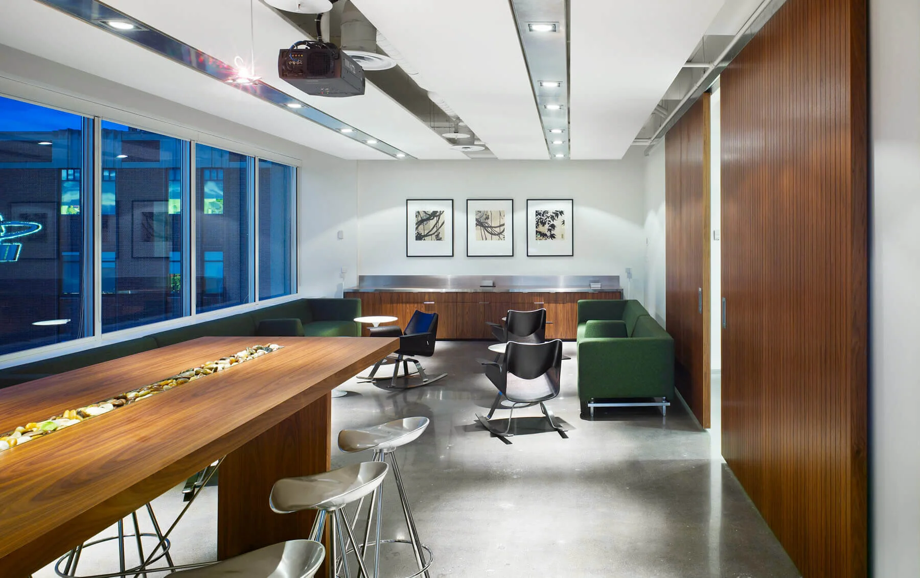
There are plenty of those, however – cozy wood-clad rooms with inviting forest murals for smaller confabs and a big space for big pitches. The pitch room features additional bespoke details, including a high-top meeting table and green felt sofas.
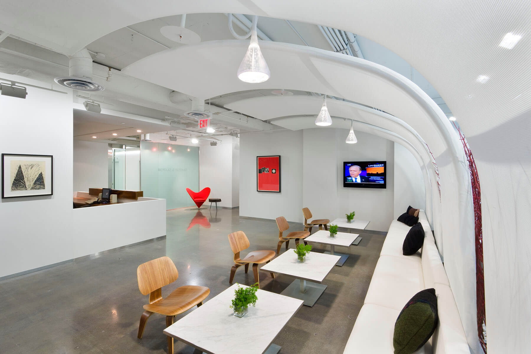
Beyond these innovative features, we chose to go iconic – naturally. Despite many custom-designed pieces – a walnut desk, slatted feature wall and wire-sculpture mascot – it is a series of modern classics that define the reception area. Molded plywood Eames chairs and marble-topped Saarinen tables line up along the windows while Verner Panton’s Heart Cone chair – which deftly personifies Lovemarks, Saatchi’s core marketing concept – greets visitors at the entrance. This trio of timeless pieces speaks to Saatchi’s status as an icon with equal staying power.


